
Introduction
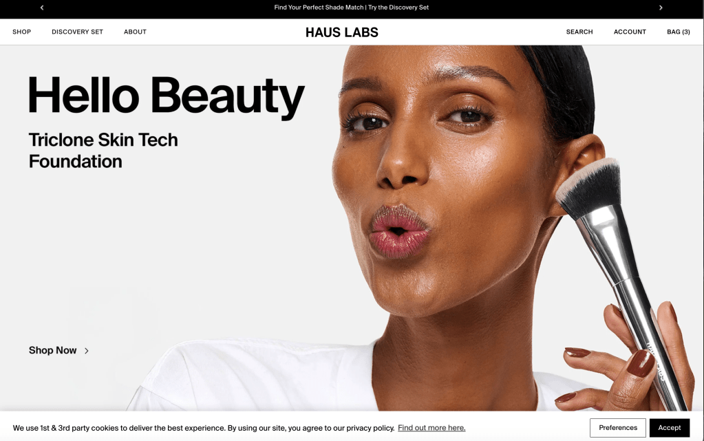
This project is all about the site “Haus Labs by Lady Gaga” – shining a light on the user experience and finding ways to improve it. As a beauty brand, they sell their cosmetics through their site, so it’s a main hub where people are interacting with their brand, learning about their products, and shopping.
In this project, we were tasked with evaluating how easy it is to use this site by using a variety of user experience research techniques and finding opportunities to improve it. For example, we considered how users are navigating the site, how they are finding their products, and how we could improve this experience.
Using a variety of techniques, including user research, usability inspection, and testing, we were able to provide recommendations on how to improve this site to make it more intuitive and effortless to use.
Project Overview
This semester, we worked on a complete user-centered design project, where we tried to examine the use of the Haus Labs website by users and then figure out how we could improve the experience.
To do this, we employed a variety of UX techniques to gather clues, such as:
- Competitor Analysis
- Personas and Scenarios
- User Interviews
- Surveys
- Card Sorting
- Diary Studies
- Heuristic Evaluation
- Usability Testing
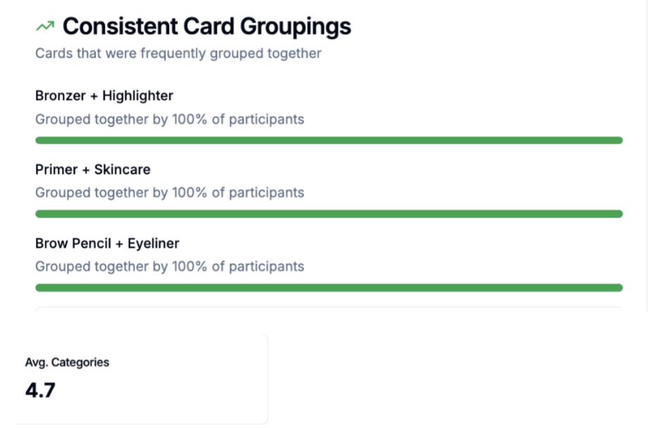
Example of Card Sorting results
Understanding the Competition
A competitor analysis was done to understand how other beauty companies are organizing their websites. Since they target the same audience as Haus Labs and offer similar products, beauty companies like Fenty Beauty and Rare Beauty were considered.
Their websites are well-organized and offer features like product categories and filters that help users find what they want in a matter of seconds. By analyzing their websites, we can understand how Haus Labs can improve its website’s navigation and how users can find products on the site.
image from Google
Understanding the Users
Personas were created to represent the average users of the website. They are a tool for the designers to think about the users’ intentions, behaviors, and expectations when it comes to online shopping for beauty products.
To exemplify this, let’s say there are two different personas for the users of the website:
Beauty Enthusiast Persona
- Regularly shops for makeup online
- Interested in product reviews and product shades
- Interested in exploring new beauty brands
Casual Shopper Persona
- Interested in easy navigation for the product filters
- Occasionally shops for makeup online
- Interested in product descriptions

User Research
Interviews
User interviews examined how users find beauty brands, how they evaluate beauty products, and what motivates their purchasing decisions when it comes to buying cosmetics online.
These interviews revealed that users seem to depend a lot on product reviews, suggestions from social media sites, and the overall reputation of the brand when making purchasing decisions for makeup products online.
Surveys
A survey was created to gather more general insights into the behavior of people and their expectations when purchasing cosmetics online. It asks questions regarding brand recognition, purchasing behavior, as well as the most important aspects of the website.
Card Sorting
Card sorting also assisted in determining how users would like the makeup products to be arranged on the website. Users tended to arrange the items based on what made the most sense to them. There was a general agreement on how to arrange the makeup by facial area with distinct groups such as:
- Face
- Eyes
- Lips
Users also tended to arrange similar items together. For instance, bronzer with highlighter or lipstick with lip gloss. Therefore, a navigation system based on facial areas would be appropriate.
Diary Study
The idea of a diary study was raised to assess how consumers interact with the beauty brand over a series of days. For a span of two weeks, the participants would be asked to record their interactions with the brand’s products as well as the brand’s websites. This method would allow the researchers to track the genuine behavior and emotions that emerge over a series of interactions with the brand. The diary study would track the following aspects:
- Intent
- Emotional state
- Devices used
- Product research
- Purchase outcomes
Heuristic Evaluation
Heuristic evaluation was conducted using the 10 usability principles proposed by Nielsen on the usability of the Haus Labs website.
The results showed that the website excels in terms of visual consistency, aesthetics, and product image design. At the same time, some usability issues were identified, including the invisibility of the filters and some aspects of the site’s navigation.
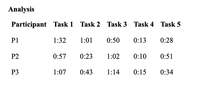
Usability Testing
Conducting usability tests involved the participation of three people who were given five different tasks to perform on the website. These included searching for a product, adding products to the cart, as well as searching for the return policy.
All the people managed to accomplish the tests well, indicating that the website is easy to use. Nevertheless, the tests revealed that the users took a long time searching for foundation products. There were instances where the users missed the price filter.
Key Findings
A few things the study revealed as important takeaways regarding the user experience of the Haus Labs site are as follows: Users would benefit from more clear navigation, as this would allow them to more easily find the products. Users seem to read product information to identify the major features. The price filter is not immediately noticeable. The way the categories are organized may not immediately match the user’s mental organization of the different types of makeup.
Design Recommendations
Based on the research above, the following are a few clear recommendations:
- Improve the prominence of the main categories.
- Highlight the most important product features.
- Improve the prominence of the price filtering tools.
- Improve the product sorting by facial areas like Face, Eyes, and Lips.
These changes will help enhance the customer experience while shopping by making it easier for them to find what they need.
Conclusion
This project demonstrates how user experience research can aid in identifying usability problems and informing changes to improve the usability of an online store. Through the use of several user experience techniques, the project has provided valuable insights to improve the usability of the Haus Labs website and make the user experience better.
